ESPN Fantasy Homepage Redesign
I just want to find my fantasy team.
Type
Homepage Redesign
Discipline
UI/UX Design
Year
2024
Project Overview
As football season approaches one of the things I look forward to most is playing fantasy football. This year one of my leagues is using ESPN’s platform. While scrolling on my computer recently, I decided I wanted to check out my team, so I headed over to ESPN’s fantasy website.
When I got to the homepage, I was completely overwhelmed and frustrated with the user experience. I couldn’t find my team and was bombarded with a million articles, immense NAV bars, and countless features. So I decided to redesign the page for a more intuitive user experience.

Process
For this project I decided to use a modified version of a design sprint but instead of completing it in a week, I only gave myself one day to ideate, build, and launch the page.
- Problem
My main issues with the design of the homepage are poor visual hierarchy, there are too many features & sections included, and the overall page feels very busy. Without a clear user journey, the user experience of the page can become frustrating and overwhelming.

This section feels way too cluttered; could be condensed into one single menu or navigation bar.
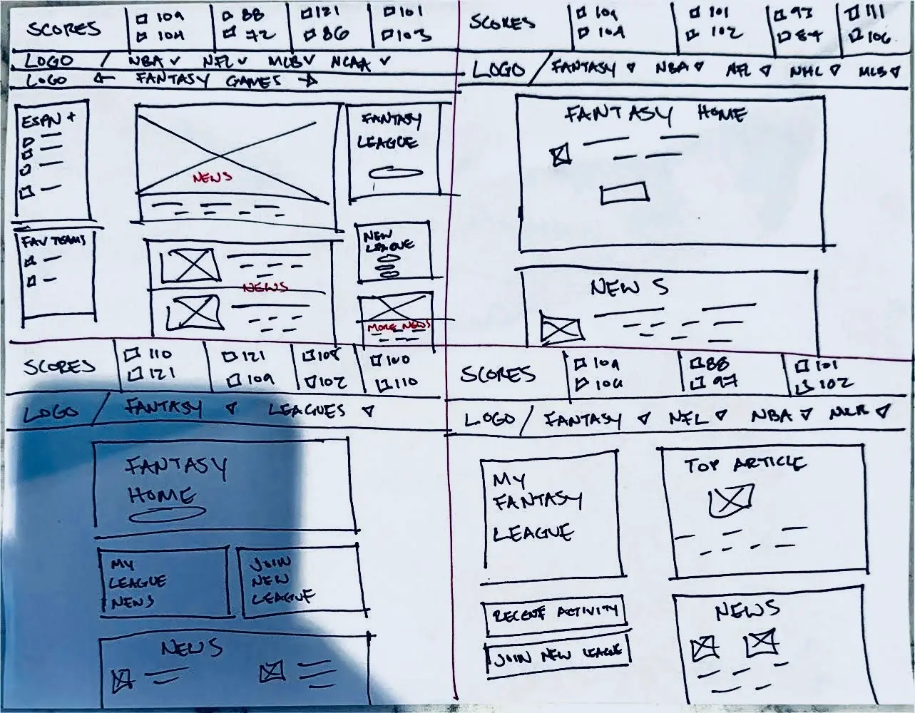
Section unnecessary; users are on this page for Fantasy, not ESPN+.
Should be more prominent.

Too cluttered.
Unnecessary.
Should be more prominent.
- Possible Solutions (Wireframe Sketches)

I first began by sketching the original homepage (top left) and then came up with 3 different variations of a redesign. My main goal was to find a way to make the user journey more intuitive without removing too many features.
I eventually settled on a variation of the bottom left wireframe.
- Final Design
Before

After

Condensed NAV bar and score tracker.
User's Fantasy team/league now front & center.
News articles moved down to focus on main UX.
Unnecessary features removed.
What I Learned
Although this design challenge was just for fun, it taught me the importance of designing web pages with your user as your main focus. I was so dissatisfied with ESPN’s Fantasy homepage that I decided I should take matters into my own hands and design something I think is better for their users.
Moving Forward
I would like to do more of these redesigns in the future to learn better design principles and to improve my overall design skills. If anyone at ESPN is reading this, let’s work together!
