KIDS SEE GHOSTS App UI Design
Buying merchandise at a concert shouldn’t be a hassle.
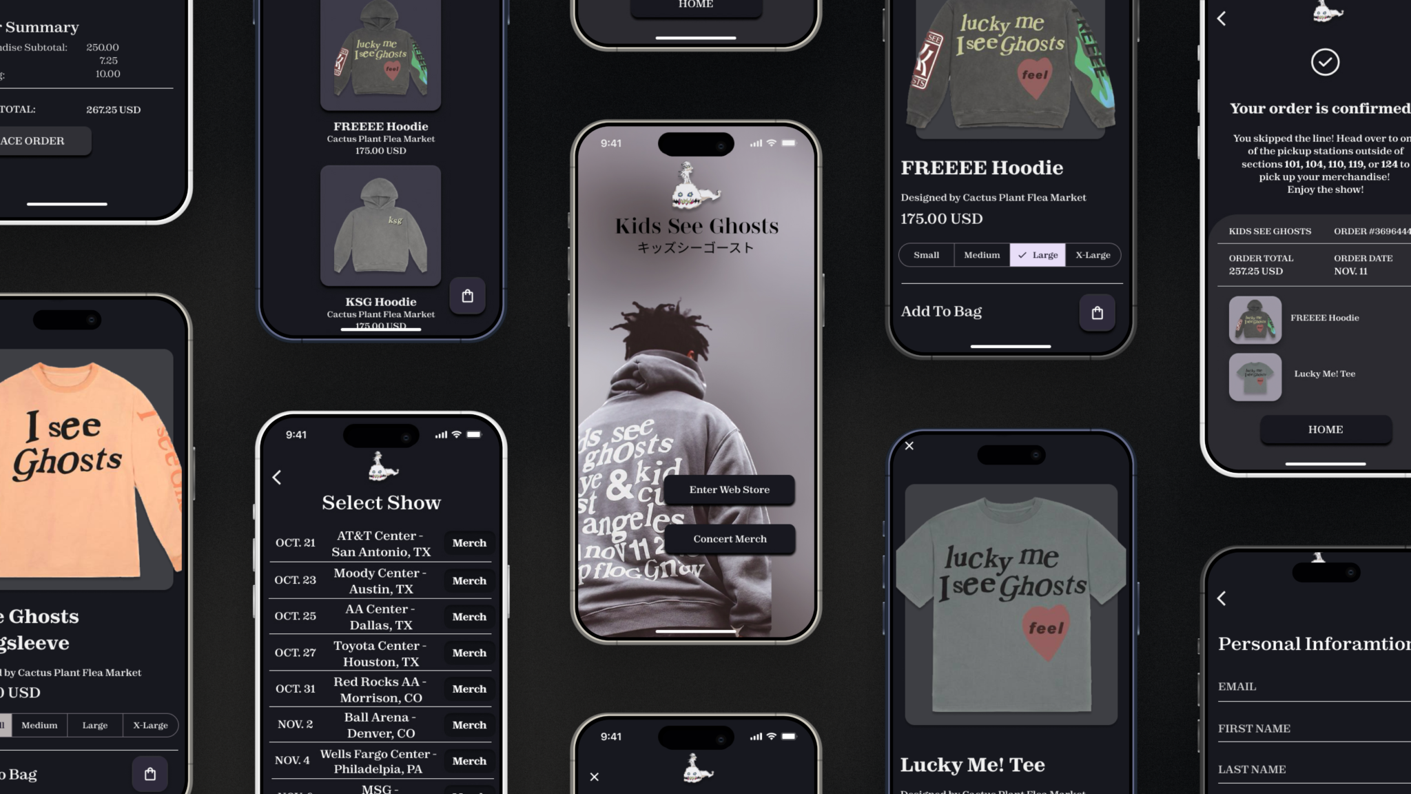
Context
I have been attending concerts since I was a teenager. Like many other concert-goers, I try to buy a t-shirt at every show I go to. At nearly every show I would encounter the same problem: merch lines. I’ve stood in lines for hours, sometimes causing me to miss some of the concert. This got me thinking: how could this experience be improved?
Client
Student project for Google UX Design Certificate Program
Role
Entire product design from research to conception, visualization, and testing
Year
2023
SUMMARY
Securely and conveniently pre-order and purchase concert merchandise ahead of seeing a live show.
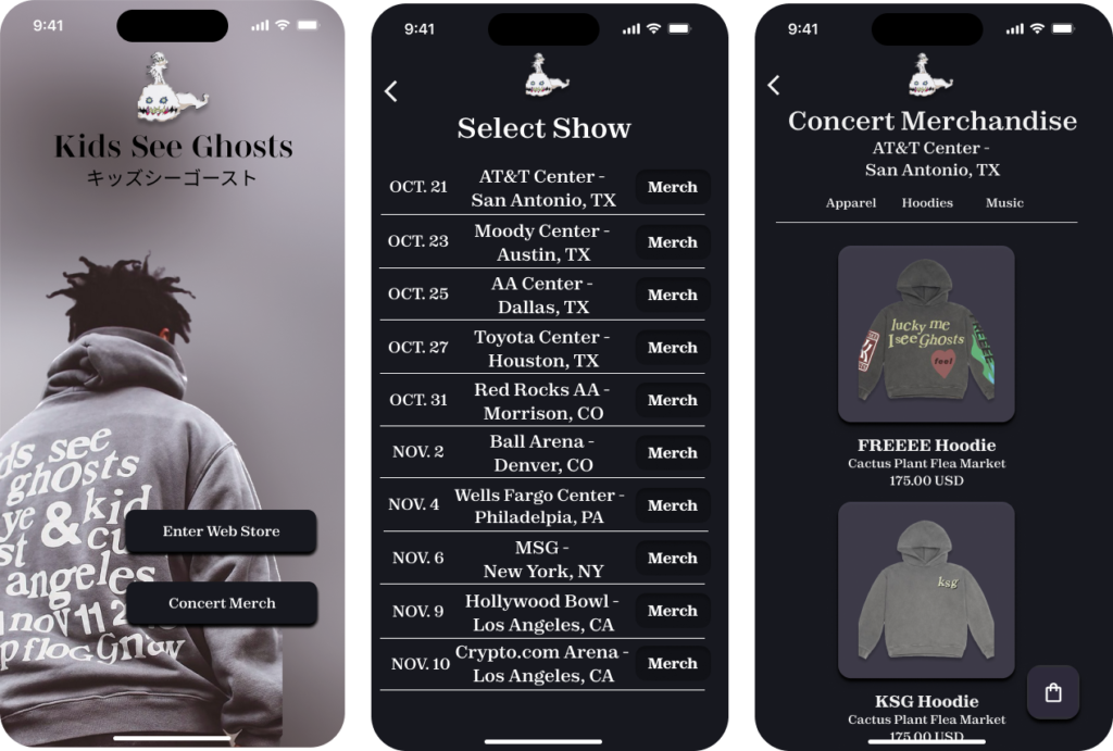
I decided to split the app into two user-flows: one for pre-ordering merchandise to pick up at a show, and one for fans not able to attend the concert to have concert items shipped directly to them.
The Problems
Long lines for merchandise at concerts can be frustrating and cause you to miss the show.
High demand for limited merchandise pieces make it difficult for the average fan to purchase merchandise from Kids See Ghosts.
The Goal
Create a mobile app that allows fans to easily purchase merchandise and order ahead for concert items.
Processs

Design Thinking Framework
I followed the design thinking framework by first conducting user research to build user empathy. After synthesizing insights from interviews, I then defined our user problems and began to ideate on possible design solutions. Once I landed on a solution to our users’ problems, I then began to prototype and had users test the product.
Understanding The User
I conducted interviews and created empathy maps to understand the users I’m designing for and their needs. A primary user group identified through research was young adults interested in music and fashion.
User Pain Points
Inaccessible
With such high demand for limited merchandise pieces, it has become very difficult for the average fan to obtain KSG merchandise.
Inaccessible
With such high demand for limited merchandise pieces, it has become very difficult for the average fan to obtain KSG merchandise.
Time
Lines for merchandise at concerts (especially festivals) can be up to a few hours long and do not guarantee you your purchase.
Time
Lines for merchandise at concerts (especially festivals) can be up to a few hours long and do not guarantee you your purchase.
Financial
Because the merchandise is so difficult to purchase, people often resell the pieces for up to 5 times the retail price.
Financial
Because the merchandise is so difficult to purchase, people often resell the pieces for up to 5 times the retail price.
User Persona

Problem Statement:
Chloe is an avid concert-goer who needs to be able to pre-order her merchandise because waiting in long lines at the venue is a waste of her time.
User Journey Map
Mapping Chloe’s user journey revealed how helpful it would be for users to have access to a dedicated Kids See Ghosts app.

Competitive Analysis
Today, every music artist is selling their merchandise online. In addition to using these online stores and apps, a competitive analysis was performed to learn more about how these competitors handled the pain points users reported in my interviews.
Gaps
- With the exception of Drake, none of our musician competitors offer a mobile app
- Competitors don’t offer the option of preordering concert merchandise
- Items can only be shipped, no pickup option available
Opportunities
- Create a well designed app specifically for concert merchandise
- Integrate our app with a concert ticketing system that allows customers to preview and preorder merchandise for the show they’re going to
- Provide the option for customers to have items shipped to their home or pickup at the concert
Design Goals
Our KSG app will let users pre-order and pickup concert merchandise, which will affect concert goers by allowing them to skip the long lines at the venue. We will measure effectiveness by the number of items ordered through the app.
Early Iterations/Sketches

Taking the time to draft iterations of each screen of the app on paper ensured that the elements that made it to digital wireframes would be well-suited to address user pain points. For the home screen, I prioritized a quick and easy way for users to browse merchandise. Another important feature was the ability to pre-order items from specific concerts.
Wireframes
As the initial design phase continued, I made sure to base screen designs on feedback and findings from user research.
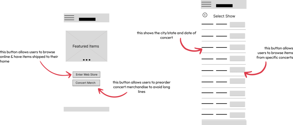
Different concerts have different merchandise so users needed a way to order items from specific shows. The screen on the right allows users to select the show they’re attending and pre-order their merchandise.
Low-Fidelity Prototype
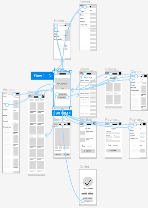
The low-fidelity prototype connected the primary user flows of browsing merchandise and ordering (and pre-ordering) concert merchandise.
View Low-Fidelity Prototype
Usability Study
I conducted two rounds of usability studies. Findings from the first study helped guide the designs from wireframes to mockups. The second study used a high-fidelity prototype and showed what aspects of the mockups needed refining.
View Research Plan
View Usability Study
Round 1 Findings
- Users want to ship items home
- Users want to preorder from shows
- Users want to preview items before buying
Round 2 Findings
- 2 separate checkout processes are needed
- Users need an easy way to switch from different sections of store
Refining the Design
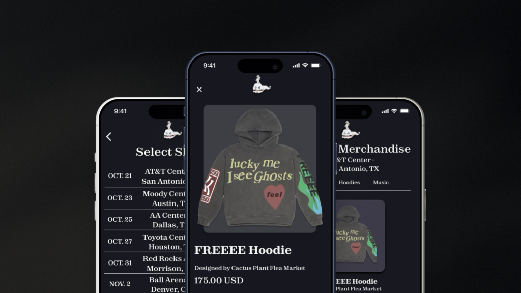
Mockups

Early designs allowed for users to purchase items, but there was no place to enter personal information such as their name, contact, & shipping information. A second screen was added to make the checkout process easier.

The second usability study revealed frustration with confirmation of orders. The early iteration of the Order Confirmation screen didn’t give an order summary or include details for concert pre-orders. Both of these features were added after usability studies.
High-Fidelity Prototype
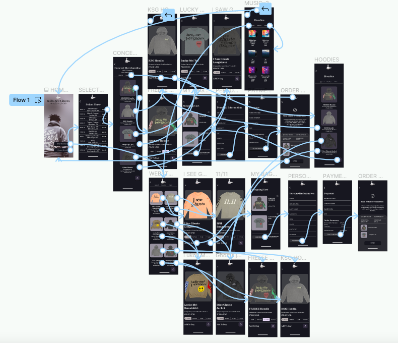
The final high-fidelity prototype presented easier user flows for browsing merchandise and checkout. It also met user needs for a pickup or delivery option.
View the Kids See Ghosts high-fidelity prototype
Final Designs


